GUIDES
Interior design trends for 2027
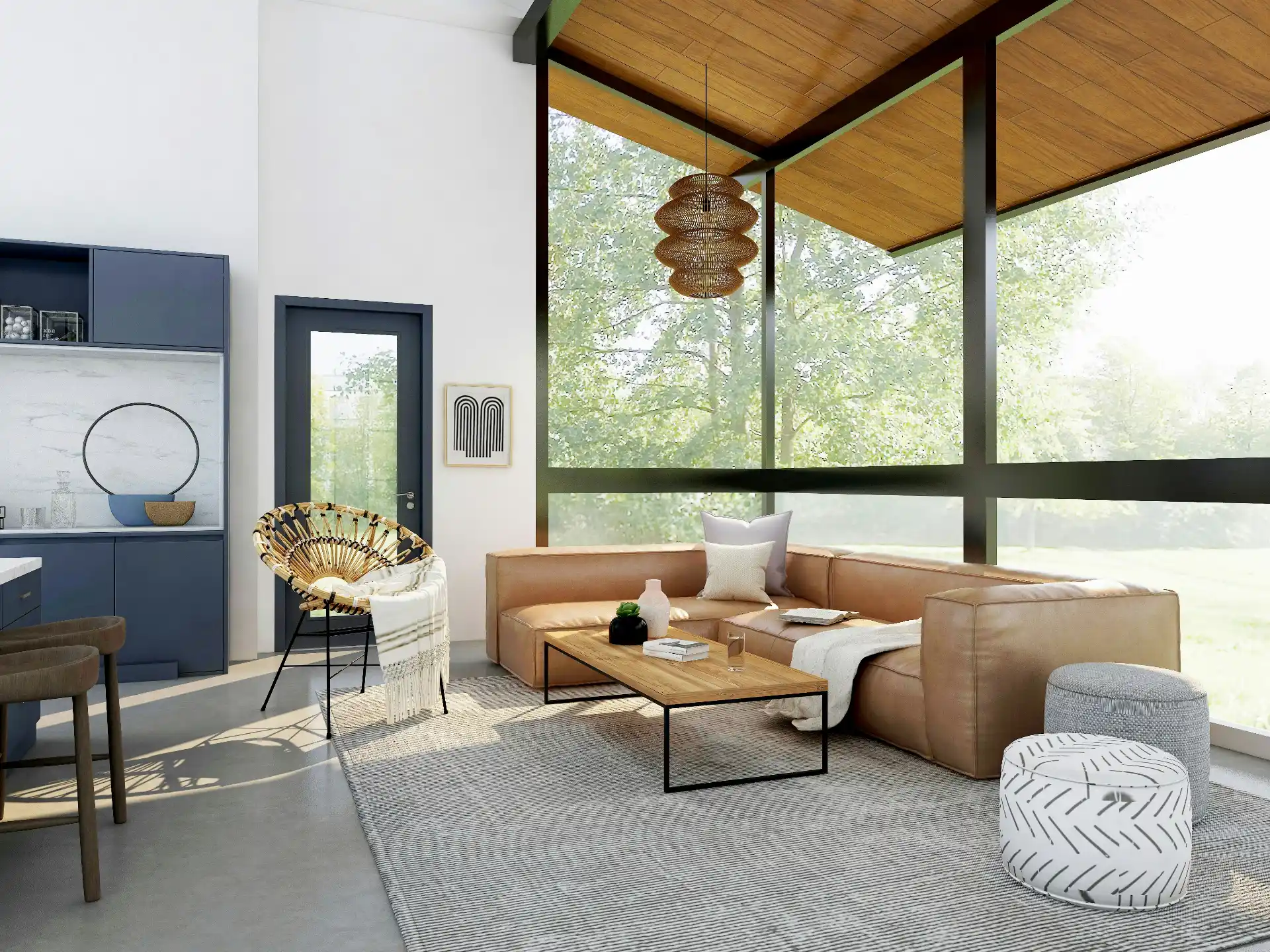
The 2027 colours of the year, from Sherwin-Williams Celery to WGSN Luminous Blue, plus the materials, layouts and ideas shaping homes next year.
The main direction for 2027 is warmth and feeling over polish. Forecasts point to earthy colours and soft greens, rooms with clearer purposes, kitchens that behave like living rooms, handmade and collected pieces, and materials chosen for how they feel as much as how they look.
None of this arrives overnight, and the best trends are the ones that suit the way you already live. Below is a summary of what forecasters and paint companies have announced so far, with notes on how to use each idea without creating a home that dates in two years.
At a glance: soft greens and warm earth tones, defined zones, kitchen-as-living-room, analogue spaces, craft and heritage pieces, tactile materials, hidden technology; cool grey and stark white are fading.
The colours of the year for 2027
Several major paint companies and forecasters have already named their picks for 2027, and a clear pattern is visible: green, softened and natural.
Sherwin-Williams, together with HGTV Home by Sherwin-Williams, announced Celery (SW 6421) in September 2026. It is a light herbal green with yellow undertones, described by the brand as a tinted neutral: calm enough for walls, fresh enough to lift a room. It works especially well on kitchen cabinetry and alongside natural timber.
Dulux chose Soulful Sage, a pale, heritage-feeling green. Valspar went in a different direction with Cottage Door, a soft powder blue meant to sit with almost anything. Graham & Brown picked a dusty pink.
The trend forecaster WGSN and its colour partner Coloro named Luminous Blue as their Colour of the Year 2027, a saturated, deep blue chosen under a theme of interconnectedness. In interiors it reads best as an accent: a painted door, a velvet chair, glazed tiles.
Benjamin Moore has said it will reveal its 2027 colour in October, and Pantone usually announces in December, so expect more names before the year ends.
Warm earth tones take over from grey
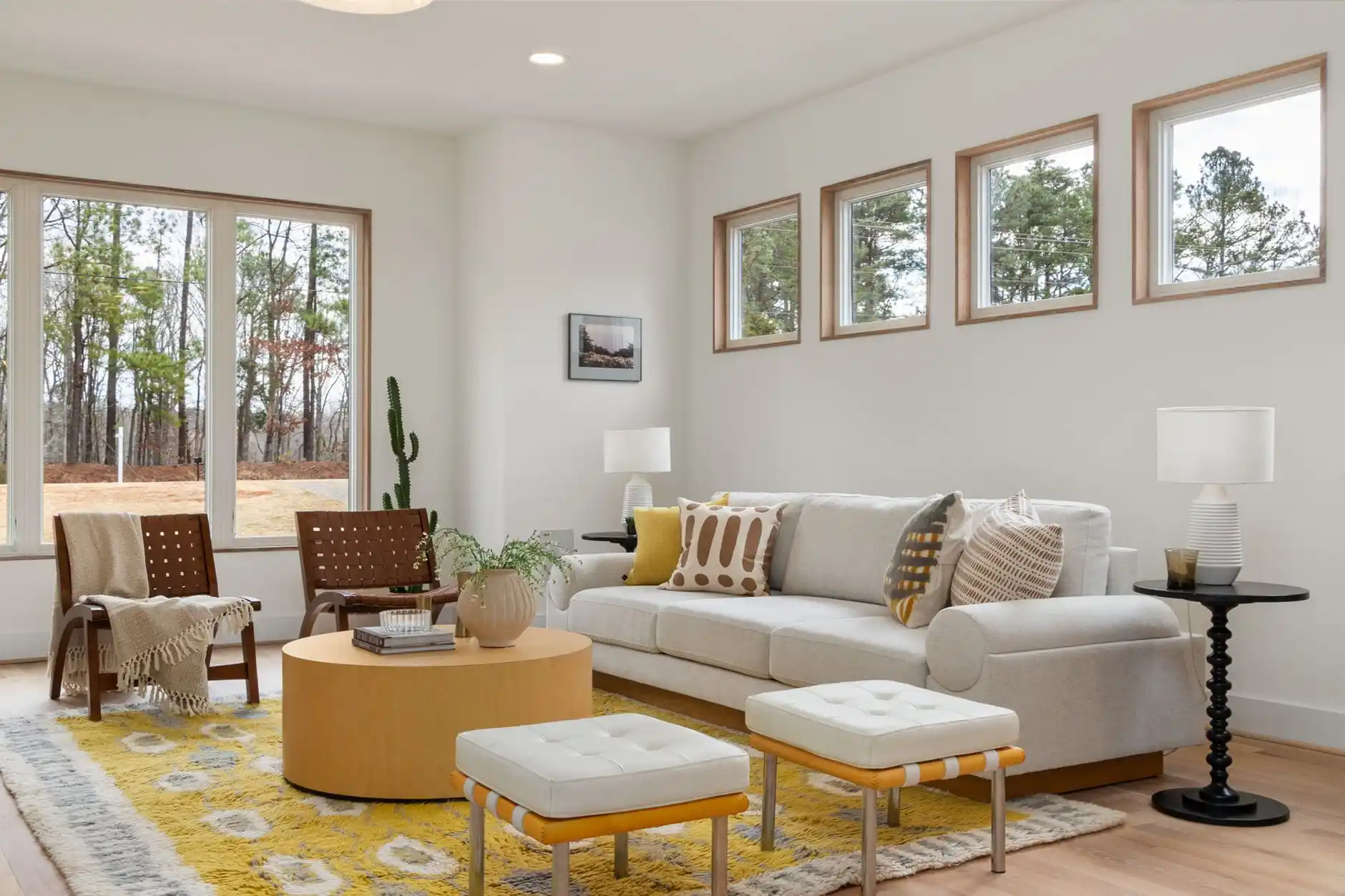
The cool grey and white schemes that dominated the past decade are giving way to warmer bases. Expect mushroom, clay, terracotta, ochre, mocha and chocolate brown, often paired with creamy linen whites rather than bright ones.
These colours are kind to natural light and flattering at night. They also suit timber, stone and wool, which explains why they keep appearing next to the materials trends below. For a way to build a scheme around them, see how to choose a colour palette for your home.
How rooms are being used
Defined zones in open plans
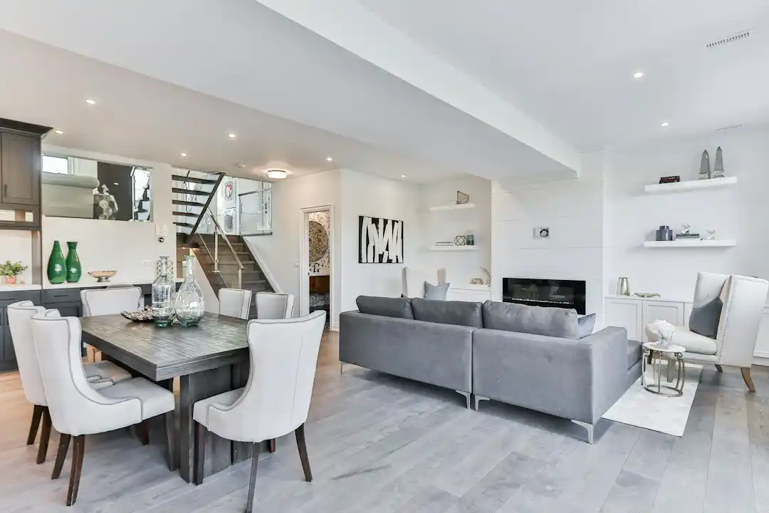
Open-plan living is not disappearing, but people want more privacy and more sense of place within it. Half-height walls, glazed partitions, sliding panels, changes in floor level and well-placed joinery are being used to create corners for work, reading or quiet without closing the space completely.
Kitchens that feel like living rooms
Kitchens are getting softer: upholstered banquettes, freestanding dressers, table lamps on worktops, rugs underfoot and timber in place of high-gloss lacquer. Larger homes are turning the walk-in pantry into a designed feature with its own lighting and finishes, which keeps appliances and clutter off the main counters. See how a working kitchen can still feel welcoming in A place to gather.
Analogue corners for screen-free time
Reading nooks, listening corners with a record player, game tables and craft spaces are a growing request. The idea is simple: a part of the home designed for slowing down, with comfortable seating, good task light and no screen in view.
Materials and finishes to watch
Craft and the collected home
Handmade ceramics, woven textiles, carved timber and visible joinery are favoured over mass-produced decor. Antique and vintage furniture is being mixed into contemporary rooms more casually, without period formality. A collected look takes time, which is part of its appeal.
Texture over shine
Limewash and clay plaster walls, bouclé and wool upholstery, honed rather than polished stone and brushed rather than mirror-finish metals all feature in 2027 forecasts. Highly polished chrome is being toned down in favour of brushed, aged and mixed finishes.
Darker timbers
Walnut, smoked oak and stained ash are returning to cabinetry, panelling and furniture, often against lighter walls. Stone is also being used more boldly, as full wall panels and sculptural pieces rather than only as worktops.
Technology that stays out of sight
Smart home features are expected, but nobody wants a room that looks like a control panel. Speakers are built into joinery, televisions sit behind sliding panels or display art when off, charging points are hidden in drawers and lighting scenes run quietly in the background. The technology is planned early so it can disappear.
What is on its way out
All-grey schemes, cold white boxes and rooms styled to look perfect in photographs are losing ground. So are matching furniture sets bought in one go, high-gloss everything and decor that exists purely to follow a trend. In their place: rooms that look lived in, warm and particular to the people who use them.
Following trends without dating your home
Treat trends as a menu rather than a rulebook. Put the most fashionable colours and finishes on things that are easy to change, such as paint, cushions, a rug or a single chair. Spend on lasting foundations: good layout, natural materials, decent lighting and furniture built to be used for years.
The interiors on iartun are designed in that spirit: shaped by light and daily life rather than by a season. If you are planning a change for 2027, start a conversation with us.
FAQ
What is the Colour of the Year for 2027?
There is no single answer, because each company chooses its own. Sherwin-Williams picked Celery, a soft yellow-green; Dulux chose Soulful Sage; Valspar chose Cottage Door, a powder blue; and WGSN with Coloro named Luminous Blue. Benjamin Moore and Pantone typically announce later in the autumn.
Is grey still in style for 2027?
Cool grey as the main colour of a home is fading. Designers are moving towards warmer neutrals such as mushroom, greige, clay and creamy whites. Grey still works in small amounts or in warmer, brown-based versions, especially when paired with timber, stone and soft textiles.
What kitchen trends are expected in 2027?
Kitchens are becoming softer and more like living spaces, with timber cabinetry, furniture-style pieces, table lamps, rugs and seating. Soft greens on cabinets, honed stone, brushed metal hardware and designed walk-in pantries that keep counters clear are all widely forecast for 2027.
Are open-plan layouts going out of style?
Not entirely. Open plans remain popular, but people increasingly want defined zones within them for work, reading or quiet. Glazed partitions, sliding panels, half-height walls and well-placed joinery create separation and privacy without losing light or the connection between spaces.
How can I follow 2027 trends without redecorating everything?
Use trends where change is cheap: paint, textiles, lighting and a few accessories. A soft green wall, a dark timber side table or a handmade ceramic lamp can update a room. Save larger investments for timeless choices such as layout, flooring and well-made furniture.